Thursday, April 21, 2016
If You Build It
Design is more than just seeing something in a different way or creating something. Design can do so much more specifically, it can be a form of advocacy. The movie "If You Build It" is a great example of this. In the movies, design is used to bring a poor, rundown town together. Most of the kids in Bertie, North Carolina do not like school and most of the kids do not graduate. The kids do not go onto to further their education. Two designers start a new program at the local high school that is very hands on and teaches the students about design. This class allows students to think creatively while also helping out the community as a whole. The class designed and built a farmers market for their town. This was something that the town continued to back and it brought the town closer together. This farmers market then led to more businesses coming to town and it supplied more jobs for the community. This one building is helping turn this town around. All of this was because of design. The community took to this idea of the farmers market because it was though of by other community members. Design can be thought of as advocacy because something is always created for a specific purpose. The purpose changes from object to object. Design can change not only one person's life, but it can change an entire community. Design advocacy is successful because the people using the design really back the idea. It is something they want and can use. It can make big changes for people and it excites them.
Sunday, April 17, 2016
Designer Profiles 11 & 12
11. Rebekah Ratke
Rebekah is a professor in the school of interiors at the University of Kentucky. When enrolling in school she decided to start in interior design before finally getting a masters in architecture from the Art Institute of Chicago. Rebekah also takes part in the Live Learn Studio on campus. This is a study where the researchers ask the feelings of students about all of the construction going on around campus. Rebekah explained how interior design is more than furnishing a room, it is more about the people because you have to work with that person to design something that they will love and connect with. She is very optimistic that design will help continue to change the world in the future. She also thinks that new technologies will help this change in design.
12. Anne Filson
Anne is from the school of architecture. She is an art history major but also went to grad school in New York for architecture. Once Anne graduated, she moved to the Netherlands where she worked for Rem Koolhaas. She has been involved in many cool projects. For example, she helped design the Seattle Public Library and the Netherlands Embassy in Berlin. She is currently working on a project that makes 3D print furniture. This machine they are working on takes design and then cuts out the furniture pieces to make this design. This is also what Anne thinks design is heading toward. She believes that this idea of 3D printing will play a huge part in design in the future. It is cool how she talked about this new technology, and it very well could be the design of the future.
Thursday, April 14, 2016


Designer Profiles 9 & 10
9. Adriane Grumbein
Adriane is a professor at the University of Kentucky where she teaches creative advertising and strategic communication. She originally went to school in Texas where she majored in marketing and minored in design. She has a done a lot of work for trade shows and other clients. She deals with a lot of advertising and info graphs for clients. She told us her feelings on design and art. She says these things are very different because "design is problem solving" and "art is evoking a feeling." She also gave us a lot of advice that I feel was the most "real" out of all the speakers. She told us about how we will not always love everything we do for clients because we do not have as much creative freedom in those situations. I thought this was useful because it seemed like she was telling us the problems that most people will not. She was just preparing us for the real world. In the future, Adriane sees design moving more towards big data and personalization. Design is being personalized to different specifics for each client.
10. Mitzi Vernon
Mitzi is the dean for the school of design at the university of Kentucky. She has been through a lot of different schooling to get where she is at today. She has traveled all around the United States to both study and teach at different universities such as Stanford, Virginia Tech, Arizona State, and now she finds herself at the University of Kentucky. She has a masters in architecture and has completed many free lance projects while at Arizona State University.. Mitzi believes that "all things are good exercises." This is why Mitzi has worked in several different places and is always willing to try new things. When asked about what is next for design, Mitzi described the idea of "design thinking." This has been around forever to designers, but it is becoming more prevalent in the world outside of design. More people are learning about this idea of looking at something in a different way. This idea is becoming more embedded in society today. This idea will only continue to grow throughout society.
Tuesday, April 12, 2016
Designer Profiles 7 & 8
7. Melody Jackson
Melody is an architect and professor at the University of Kentucky. She came to school for pre-medicine because she enjoyed the math and sciences. However, she also really enjoyed drawing and sketching, specifically Scottish Castles. She decided to switch to architecture because she could combine her love of drawing with her love of math and science. She has done many cool designs in architecture, but her favorite one was designing her own house. She now teaches first year design students at the University. During her presentation she preached the idea that, "design is a journey." There is always design in everything and it will always follow you wherever life leads you. As for the future in design, Melody sees and increase in the use of virtual reality and holographic projection. Both of these would be helpful in showing a client exactly what the design will look like in the future.
8. Lindsey Fay
Lindsey is a professor in the school of interiors at the University of Kentucky. She had an early interest in design because she would like to draw creative places. She originally came to UK to study dietetics and nutrition, but then realized she wanted more creative freedom, so she changed her major to design. For her job she does follow ups on newly completed projects. She goes in about 6 months after the new space is open and makes sure it is running effectively and efficiently. She has designed many homes and picked the exterior and interior design for these homes, much like you see on the reality television shows. Lindsey is also the university representative for Habitat for Humanity. She helps students be creative in building these homes while also helping out others in need. This also ties into where she thinks design is heading in the future. She thinks design is evolving more around the idea of social responsibility. Design can be used to help others and change their lives. Every design has a purpose and these purposes can make the world a better place.
Sunday, April 10, 2016
Designer Profile 5 & 6
5. Ryan Hargrove
Ryan is a Landscape Architect who now teaches at the University of Kentucky. He grew up with a mom who was an art teacher, so she always challenged him to be creative and think outside of the box. He was always into art and sciences and one day he fell upon landscape architecture, which is a great combination of both. He has worked on several projects in Louisville, Kentucky and has helped planned an upcoming gardening center in a local park. Ryan thinks social equality is an issue in design so he likes to go to less fortunate communities and do these projects to help change the equality. When asked about where design is going, he said people need to teach design specifically, "Knowing how to see the world." This is why Ryan is now a professor at the University of Kentucky because he wants to teach this while building relationships with students.
6. Sarah Daley
Sarah is an interpretive designer for 21st Century Park, which is a nonprofit organization. She attended the University of Kentucky where she majored in architecture and minored in anthropology. At 21st Century Park she collects info of parkland and then has to come up with a way to share this information with the public. The coolest job she has had was for the Field Museum in Chicago, Illinois where she had to design where all of the physical aspects of each exhibit go. She is in charge of the layout of the rooms. She thinks design is only going to get better and it will always be around. Sarah said, "There is no field that can;t benefit from design." This is true because everything uses design in one way or another. She also sees design evolving even more through all of the new technology.
Thursday, April 7, 2016
Designer Profile 3 & 4
3. Scarlet Wesley
Scarlet is a professor at the University of Kentucky where she teaches retail tourism with specifics in merchandising and textiles. She got her degree in marketing from the University of Tennessee along with a minor in fashion merchandising. She worked in the allocation and planning department for Ames and then followed that with a job at Lego toys before finally turning to teaching. Some helpful advice she gave us is to approach work with the mindset of, "what can I take away from here?" I thought this was helpful because at first, you will not always get your dream job, so you should approach your current job in a way that can make you a better person. She also taught us how brands are very influential in the world and I could relate to this. I used to be a person who was focused more on the brand of clothing I was wearing than the actual design and price of it. It was cool to be able to relate to what she talked about in her presentation.
4. Ebrahim Poustinchi
Ebrahim is a faculty of interiors at the University of Kentucky. His main focuses are in architecture and digital design. He is very into robotics and using them in design. In fact he has used many different forms of robotics and digital designs at UCLA and Washington State University. I think this way of design is gonna be more relevant in the near future because society is gravitating towards new technology. The most important thing I took away from Ebrahim's presentation was when he said,"You don't need skills, it's more about the way you think." I thought this was cool because someone can have amazing ideas, but they may not have the skills to make this vision happen, this does not make them any less important. They can share these ideas and let people with the skills help them create this vision.
Tuesday, April 5, 2016
Designer Profile 1 & 2
1. Mark O'Bryan
Mark O'Bryan is a professor at the University of Kentucky's school of architecture. His love for design first started when he was younger. He was really interested with cameras and audio. The cameras play a vital role in architecture because they can help with a vision of a building. O'Bryan also really enjoys the problem solving aspect of his job as an architect. He likes having to solve problems on the fly to produce the best product. Some of the lessons he taught us is that although technology is always evolving, it does not mean it is getting better. He also taught us how it is important to have a vision and to be able to communicate that vision clearly to others.
2. Jennifer Tate
Jennifer Tate is a product designer for LG electrics in New York City. Tate sturdied interior design at UNC Greensboro before turning her attention to product design. She enjoyed the process of how things were made and manufactured. She taught the class her definition of design, "Creating something with intent." This means that everything is designed for a specific purpose. The advice Tate gave to the class was to trust your gut and understand your internal self. If we do these things we gave a great chance to be successful in our jobs.
Sunday, April 3, 2016
Museum of You
1. Baseball
2. Golf
3. Trailblazers Summer Camp
4. Chicago, Illinois
5. Vinaigrette Salad Kitchen
6. Hats
7. University of Kentucky
8. Iphone
9. Shoes
10. Macbook Pro
The ten artifacts listed above all help to describe me. These artifacts tell my story to others who may not know anything about me. I put baseball and golf because they are my two favorite hobbies. I have played baseball for the past 15 years and golf for the last 5. These are not only my hobbies, but also my passion. They are the reason I want to work in sports marketing after college. I love sports and everything about them. I decided to put Chicago on this list because I am from a suburb about 45 minutes north of the city. I remember going down to the city with my friends and family just to spend the day and visit all of the sights. There is never a specific reason for going to the city other than getting away from our everyday life. Next, I chose to discuss was coming to the University of Kentucky. This decision shows that I am committed to getting a quality education. It also shows that I am intelligent and done well in school because the University of Kentucky is not an easy university to be accepted into. This also relates to my love of sports because one of the reasons I chose to study at the University of Kentucky was because of their rich sports atmosphere. The final big scale artifact I am choosing to write about are my jobs at Trailblazers Summer Camp and Vinaigrette Salad Kitchen. These jobs show that I am a very hard working individual. It also shows that I enjoy communicating with diverse groups of people. Trailblazers is a summer camp for special needs, and I have to serve customers of all different backgrounds and diversities. I have learned to communicate with all types of people.
I have also chosen to discuss some smaller artifacts. Two of the things I have chosen to help describe me was hats and shoes. I have over 20 pairs of shoes and over 25 hats. This shows that I am very conscious of my image and I enjoy expressing my style. The hats also play a big part in my life because I am usually wearing a hat during my hobbies and work. I always wear a hat when playing baseball and golf. Especially in baseball the hat is a part of my uniform and is a way of identification. The hat is also a part of my uniform for work. This again shows my hardworking attitude and it also shows that I care about the health of our customers. I wear a hat to protect hair from falling into a customer's food. This shows that I am conscious abut others around me. The last two artifacts I chose to describe me were my Iphone and Macbook Pro. I use both of these for pretty much everything. I use them to learn ad look up information. I also use both of these to stay connected. It is a way for me to use social media and make other forms of communication with my friends and family. Especially being away at college, I use both of these devices to stay in contact with both my family and my friends who are away at different schools. This shows that I care about the people close to me and that I like to catch up and make sure everything is ok.
All of these ten artifacts may seem like simple things to any other person, but to me they mean the world. These artifacts make me the person I am today and they tell my story.
Thursday, March 31, 2016
Movie Review
I have always been a fan of movies, but this was the first
time I had to look at movies in a whole new way. This time I had to focus on
the design aspect of movies and it opened my eyes to a whole new appreciation
for the movies. I had to watch three movies: Helvetica, Everything is Illuminated, and Wall-E. All of these
movies seem different but when looking at the design aspect they are actually
quite similar. They each use design to help tell their story, but they each do
this in their own unique way. Helvetica uses
the design aspect of the movie to show us how we are constantly surrounded by
things that we are not aware of. Everything
is Illuminated teaches us that it is not always about the destination, but
it is about the journey. Wall-E teaches
us that we do not always need words to tell our story.
The first movie I watched was Helvetica is a documentary about typography and how it has changed
throughout time. Helvetica is the most popular font used in the world, yet no
one seems to notice. It is in newspapers, magazines, advertisements, etc. yet
no one recognizes or realizes that it is all the same. The movie also discusses
how Helvetica has changed over time. It used to be more creative and arts, but
now it is very simplistic. This shows how design is constantly changing. Some
people feel that this is a great form of typography, but others hate it because
it is not artistic. This also shows how each person portrays design
differently. Some people appreciate the style more than others. Helvetica did a great job of reflecting
how design is constantly changing both in general and in the eye of the
consumer.
The next movie I watched was Everything is Illuminated. This film did a great job in expressing
the mood of the movie in the setting. The main character Jonathan goes on a
search for a lady who saved his grandfather during the Holocaust. Now the
Holocaust was a bad time so the scene was designed to portray the sadness and
destruction caused by the Holocaust. However, there were also times of bright
scenery that show the positives that came out of the journey. The movie was
also designed to teach the lesson that life is not always about the
destination, but about the journey. Jonathan did not complete his end goal in
finding Augustina because she was tragically killed after saving Jonathan’s
grandfather. But throughout the journey Jonathan learned more about himself and
became more appreciative and more knowledgeable about himself and the world
around him. Everything is Illuminated did
a great job of showing how design can help portray the mood of a movie while
also teaching a valuable lesson.
The final movie I watched was Wall-E. This was an animated film created by Pixar. This movie was
designed to tell a story without using words. For most of the movie there is no
words and even when there is words it is only a couple of words because robots
are talking. I thought the director did a great job of telling the story
through the production of the film. No words were required, yet I knew exactly
what was going on and what the intended message of the movie was. Wall-E was a great movie and I think the
design aspect was awesome because that is what told this story not words like
in other movies.
I think that all three of these movies show viewers that
designed can be found anywhere and it can be found in many different ways. I
think all of these movies show how design is changing throughout time. Everything is Illuminated is about the
history of something that had occurred in the past. Helvetica shows the transformation in the design of typography from
the past and into the present. Wall-E shows
how futuristic design can be through animation and just the idea of telling a
story through actions rather than through words. All of these movies used design
in their own way to get their message across. One film was a documentary and
more informative, another film was more of an every day film with actors, and
the final film was with the newest technology of animation. All of these movies
show that design is all around us and always will be. It is up to the viewer to
interpret the design,
Overall all of these movies have taught me valuable lessons.
Helvetica taught me to open my eyes
and really appreciate the beauty around me. I should be more conscious of the
things around me. Everything is
Illuminated has taught me to enjoy the journey. I should not go around
waiting for one thing to happen in my life. I should enjoy both the ups and
downs of life because when I finally do reach my destination, it will make it
that much better. Finally Wall-E taught
me the lesson that actions speak louder than words. It is not enough to say
something, I have to go out and back up my talk with action. I also have to
make sure I am acting in the proper way at all times because you never know who
is watching. Looking at these three movies through the design aspect has really
taught me a lot and made me more aware of the deeper meanings of everything.
FONT-amental

http://vignette1.wikia.nocookie.net/poptarts/images/5/54/Frosted_Smores_Pop_Tarts_Box.png/revision/latest?cb=20121212150520
The first type of font I found interesting was the font for the popular brand Pop Tarts. The font for this product is big and bubbly. I think it plays well off of how the commercials are when everything seems innocent until the pop tart falls into the trap of the person eating it. The font also directly ties into the name Pop Tart. The font looks like it is popping out of the box and almost gives it a three dimensional affect. I think the design of this font was to have a real play on words with the brand name by having the text look like it is popping off the box.

http://bigbashphoto.com/wp-content/uploads/2016/01/Toys-R-Us.png
The picture above is of the logo of the popular toy store, Toys R Us. I think this font was specifically made to target children. This font is used to real in its target market in children because they know that only children want to shop there. The big and bubbly letters really reflect a child's personality. Children are always so happy and i think this font reflects it. I also think the "R" is purposely backwards because it plays off of the idea when kids first start writing that they often make the mistake of writing their letters in the opposite direction. I think this font is supposed to symbolize a child's writing.

http://dmv-defenders.com/wp-content/uploads/2013/08/stop.jpg
Stop signs are seen everywhere and can be recognized by pretty much everyone. The Font is designed to be big, bold, and clear. This is so there is no confusion to drivers. The word "STOP" must really stand out because it is a demand. It really stands out as a way of protection. This font is very out there and the color of the white blocked letters really stands out from the bright red. Again, this is to put emphasis on the message and command the sign is sending to drivers.

http://www.schneidersjewelers.com/files/2010/11/pandora11.png
The font used in the logo for the Pandora Jewelry store is specifically designed to represent what the sore is all about. The font is very elegant and chic just like the store. The biggest part of this font is the transformation of the "O". In this case the "O" looks like it is a ring. This font is used to symbolize what the store is all about, jewelry. This neat design tells customers what the store is before they even have to walk in the store. This font was specifically designed to tell an entire story through just a couple of letters.
http://3dprint.com/wp-content/uploads/2014/05/nike-1.jpg
The final font I chose to discuss is of one of the most popular brands int he world, Nike. The font of Nike is used to portray the company and athletes that are sponsored by Nike. The font is very big and bold just like the athletes who wear the brand. The font also has a very strong and tough look. This exemplifies the qualities of all the athletes that Nike endorses. Nike is an athletic performance brand and just like the font, it wants its athletes to be big and tough. The font for the "Just Do It" phrase is very basic but also very meaningful. The simplistic design is used to motivate someone by saying it is not a big deal, just go out and work hard and become successful. Also the period makes this popular phrase int a motivational demand because it is telling consumers to go out there and do whatever it is you need to do in order to become a better person.
Analysis 9 & 10

http://www.showmeitaly.com/wp-content/uploads/2014/05/Show-Me-Italy-Vatican-City-Tours.jpg
The photo above is related to to Holly Donohoe's artifact, the Vatican City. The Vatican City is found in Italy. The movie was mainly based off of one place in the Vatican City, the Sistine Chapel. The chapel is home to the pope. It cost about $17 US dollars to visit inside. This relates to the business aspect of the chapel. The artistic design in the chapel has to do with the inside of the chapel. On the inside is the painting of Michelangelo. This painting alone attracts roughly 5 million visitors each year. This painting is relating with consumerism through the belief of religion. God is depicted in the painting more than 6 times and even the famous biblical story of Adam and Eve is portrayed in the painting. The movie was informative but I thought there could have been even more analysis about the design of the chapel.
http://www.disneyworldlive.com/DisneyMap.jpg
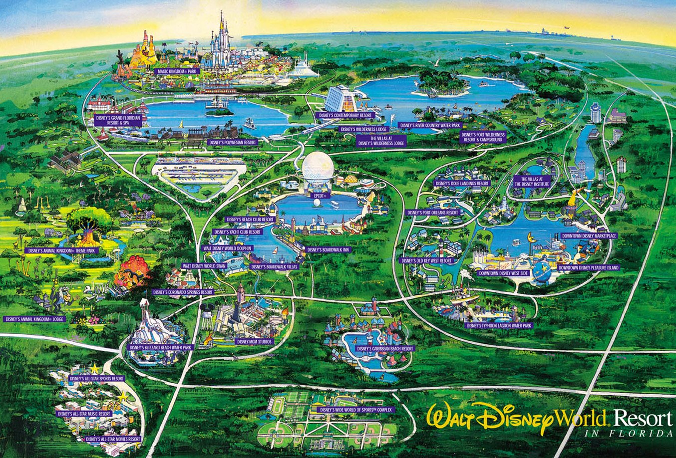
The photo above is a map of Barry Ordu's artifact, Disney World. Disney world is located in Florida and is home to many different resorts and theme parks. It is known as "worlds within the world" because every place is different and it is like its own world. A lot of these worlds are based off of disney movies. This allows families, especially kids, feel like they are in the same world as their favorite movie characters. Disney World is home to 4 amusement parks and 2 water parks. There are also many golf courses throughout the resorts. There is something for people of all ages to do. Disney World gets most of its publicity in the media through their constant advertisements like in the Super Bowl and through the Disney Channel network. I thought this movie was very informative and dod a great job of discussing all of the different aspects of design that were covered in class.
Tuesday, March 29, 2016
Movie Discussion Summary
In our movie discussion in class I learned about how design is prevalent in movies. Design is used to help tell the story/plot of the movie without saying anything. The scenery and color of the set help portray the mood of the movie. Also the style of clothing the characters wear can reveal a lot about their personality. A lot of thought is gone into producing a movie. A director must use design to portray their message in another way other than the script. Sometimes the design in a movie is actually better at setting the mood to a scene then the script does. There is also a common theme amongst the movies. All of the movies discuss the process and evolution of the world. One movie is about the past, one is more present day, and the last one is futuristic. These movies show the process and evolution of design in movies.
Analysis 7 & 8

http://cdn.slashgear.com/wp-content/uploads/2009/09/monster_beats_solo_2-318x500.jpg
The image above is of Samantha Seger's artifact. The artifact is Beats Solo headphones. The headphones are part of a brand created by rapper and producer Dr. Dre. The brand was created in 2006. The headphones are made to produce studio quality sound. The sound projected is very similar to the sound heard in a recording booth. The headphones and brand in general get a lot of publicity. They do not have a ton of marketing but they have a lot of endorsements with athletes and musicians. They use commercials with these famous people to advertise their product. When people see their favorite celebrities and athletes, it makes them want to go out and buy a pair of their own. These headphones can be seen as a high quality product that produce incredible sound. The movie did not address all of the aspects that were discussed in class and the movie itself lacked creativity.

https://upload.wikimedia.org/wikipedia/commons/5/54/2006-2007_Volkswagen_New_Beetle.jpg
The picture above is of Carrie Burkett's artifact, the Volkswagen Beetle. The Volkswagen Beetle is a small german car. They are very popular, however, there are also many negative stereotypes with this car. I liked how Carrie showed these stereotypes, but then also then squashed the stereotypes and say that they do not matter. She then showed a video of the process of a Volkswagen Beetle being made. It was cool to see how everything was made individually, but when they all come together they produce a nice car. I also liked how Carrie brought in the popular game "slug bug" in her movie. She used a television advertisement to portray this. It was cool to see the advertisement because I knew the exact game they were playing and how it directly correlates with the car. The only thing is that not every aspect that was discussed in class was present in the video. The process and product was prevalent along with media, however, those were the only ones discussed in the video.
Sunday, March 27, 2016
Consumer Product

http://files.techcrunch.cn/2013/11/ps-evolution2.jpg
The photo above is of one of the most popular consumer products in the world, the Sony PlayStation is the most popular and most recognizable game system in the world. There has been an evolution since the first model came out. At first the system only played games but as it has evolved, there have many additions such as DVD disks and now blue-ray disks. In the newest system, the PlayStation 4, everything is downloaded and there are no more disks. The games must be downloaded through the PlayStation server and not purchase the disk like for the past systems. The PlayStation is made and developed in Japan. The physical design of the system has changed. It started out small because there were no other features other than playing games. But now they are bigger because they must hold hard drives and other technological advancements. There are also better processors so the gameplay is fast and the graphics make you feel like you are not watching the game, but living it. The Playstation is sold throughout the world and it is distributed in all different types of stores. It is sold in super stores like Walmart, technology stores like Best Buy, and specific game stores such as Game Stop.
Analysis 5 & 6

https://s-media-cache-ak0.pinimg.com/736x/b7/98/8f/b7988f7c1f82c6dc6e225470e424c570.jpg
The picture above is of Trey Huntsman’s artifact, Cliff Hagan Stadium. This stadium is home to the University of Kentucky baseball team. The place is designed as a terrific atmosphere for people of the same passion, baseball, to gather and watch their favorite team play. There are many different design features inside the stadium. There are many different styles of seating for fans, students, and professional scouts. There is also a lot of media design in the stadium. The scoreboard has a video board on it that plays videos and other things for the fans before and during the game. There is also a lot of consumerism that takes place inside the stadium. There are concession stands as well and merchandise stands. These places help bring revenue in for the university. These vendors help attract more fans and increases the consumerism throughout the stadium and university.

http://www.speedwear.co.uk/images/scarfmod.jpg
The picture above is of Ellen Prall’s artifact, a scarf. This scarf is designed to be worn in the winter to keep the person warm. It wraps around the neck and prevents the cold air from making contact to the person’s skin. The scarf is from the well -known brand GAP. Gap is part of a large chain of clothing and is very popular and well-known throughout the entire United States. This part of design is known as fashion and fashion allows for a person to speak for themselves without actually using words. It is a way of expression for people and every person has their own style. This is a great way to learn about someone without even having to talk to the person. The scarf in general is very popular accessory in the cold weather because they are both fashionable and can be worn in many different ways.
Thursday, March 24, 2016
Analysis 3 & 4

http://www.ballparksofbaseball.com/nl/pictures/2013/busch_main.jpg
The picture above is of Katie Strickland's artifact, Busch Stadium. Busch Stadium is located in St. Louis, Missouri. It is home to the St. Louis Cardinals, a professional baseball team. The stadium was built in 2006 in downy town St. Louis. The iconic St. Louis Arch can be seen in the background and is clearly visible from any seat in the stadium. There is a lot of design throughout the stadium. Gate 3 is designed to be a small replica of a bridge that leads into the city. It is very iconic to most St. Louis natives. Also there are the design aspects in the actual field. The grass behind home plate is painted with the team logo while the outfield grass is cut in an artistic pattern. These two things give a certain character to the field. There is a lot of consumerism that takes place especially in the food. There are many different food stands that makes it easy for everyone o find something they like. Also there are vendors who will serve a fan at their seat so the fan will not have to get up and miss any of the game. Although there is no direct for of media, the team is all over the media. The more publicity the team gets, the more the stadium gets. The Cardinals are usually successful and have been in the World Series multiple times over the last few years, this means that Busch Stadium is constantly on TV for millions to see.
https://images-na.ssl-images-amazon.com/images/G/01/stores/sport-goods/titleist-prov1x.jpg
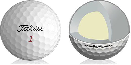
The picture above is of Austin Johnston's artifact, a Titleist Pro V. The Titleist Pro V1 is a popular golf ball that is used by many lovers of the game of golf. The core of the golf ball is first made when rubber is turned into a marshmallow-like shape. The rubber is then put into a spherical mold and baked at over 150 degrees celsius. Then a hard outside coating is added to protect the core of the golf ball. This outer coating is designed with many dimples. These dimples are made to help with aerodynamics and loosing the ball to travel further. It also allows golfers to put different spin on the ball when it lands on the free. This golf ball is used by some of the best golfers in the world. It is constantly on TV in some of the most viewed golf tournaments in the world. To the golf community this ball is probably the best and most popular golf ball. As a gofer myself, I can support this claim, in that the Titleist Pro V! is the best golf ball on the market.
Tuesday, March 22, 2016
Analysis 1 & 2

http://cdni.llbean.com/is/image/wim/175064_1914_41
The image above is of a pair of L.L. Bean Boots. This was the artifact selected by John Usher. After his informance video I learned a lot about the bean boot. I learned that is 100% hand made in Maine so it is produced in the United States. It was made to keep feet warm and dry throughout the seasons. The boot is waterproof and has a 100% satisfaction guarantee that they live up to. A way they live up to this is no matter how old a consumer's bean boots are, they can mail them in and the company will repair them for the consumer. I found it awesome how the company recycles 83% of their waste and uses it to make more bean boots. The bean boot is very popular and they continuously sell out. They sold 450,000 pairs last year and this year they are expecting on selling 500,000 more! These boots are very popular for college students all across the United States because they are perfect for all conditions and will keep your feet safe.

http://www.rstreet.org/wp-content/uploads/2013/07/farm.jpg
Above is a picture of a farm because Olivia Marsh decided to talk about her family's farm for her artifact. She talked about how they decided to put a house in the middle of the field because there is already a road leading up to it and there was another house that was built on the land. She also talked about the specific layout of the the grain bins. They were staggered to make it easier to fill them up so the grain elevator can pivot from one central point. This design makes it easier for them to fill the grain bins. I also learned that the farm produces about 100,000 bushels of corn and about 40,000 bushels of soy! They also produce lots of cows that they sell locally. All of their crops are sold locally and can usually be found at local farmers markets, This is how their crops and the farm gets its name out to the public. They do not use any media except for face-to-face interaction at the local farmers market.
Thursday, March 10, 2016
Sunday, March 6, 2016
Target Observation

Water Slide, Target. Personal photograph by author. 2016.
The picture above is of an inflatable water slide. The water slide is made for young kids. It is a way for the kids to have the fun of a water park without actually going to the water park. The water slide itself has many different parts to it. All of these parts serve a different purpose. There are two slides to accommodate many kids, as well as a rock-climbing wall that serves as a way to get to the top of the slide. The slide is inflatable so it is very easy to set up and it is also very easy to take down. Since it can be deflated, the slide is also easy to store because it does not take up a lot of space. It is also very safe for children to play on because the inflatable is soft and very forgiving if a child were to fall. The joy this water slide brings kids is portrayed on the front of the box. When parents see the joy on the kids' faces on the box, they want to buy it for their kids so they will have the same joy as shown on the box.
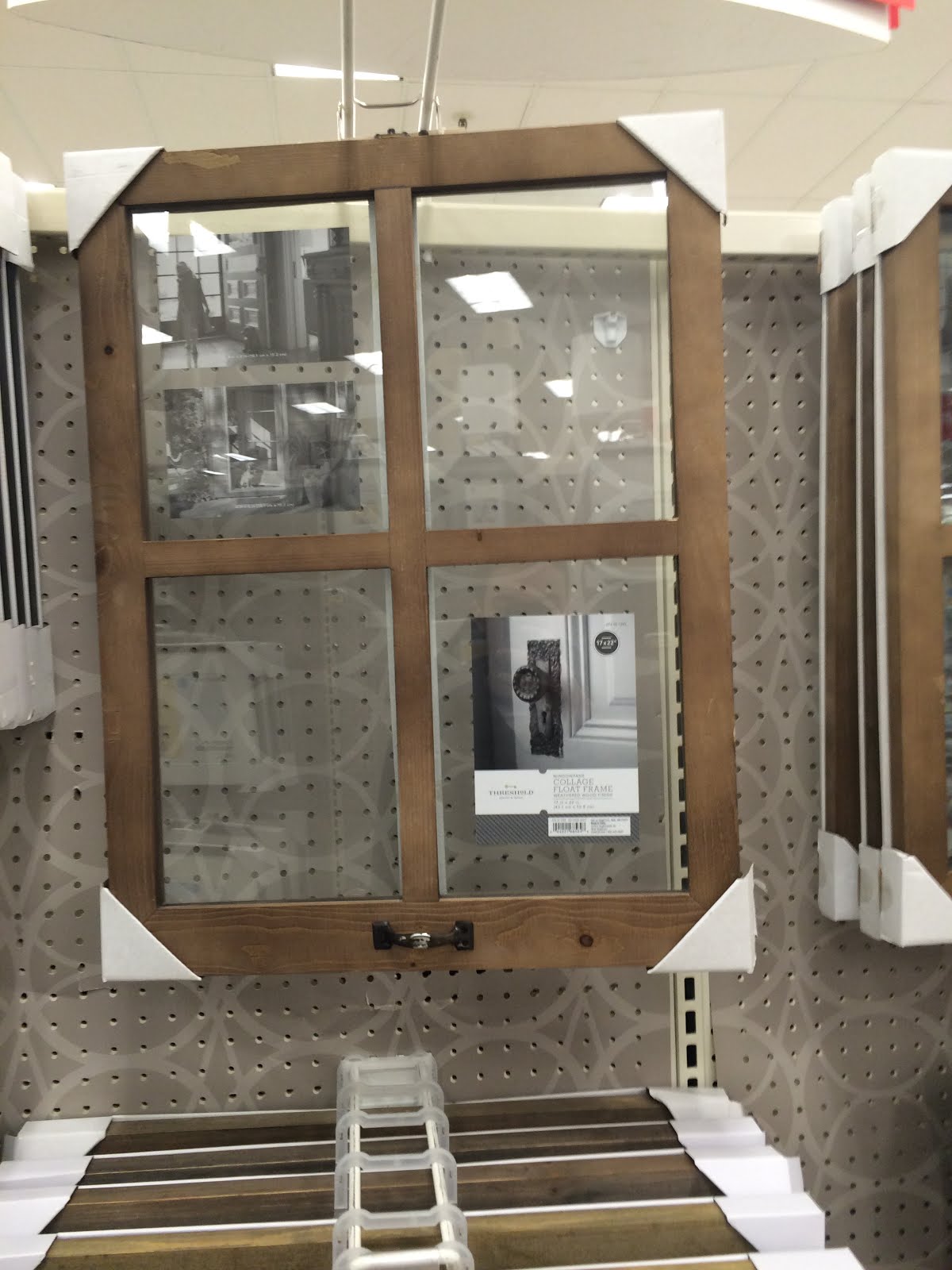
Picture Frame, Target. Personal photograph by author. 2016.
The picture above is of is of a picture frame. The picture frame is designed to look like the window pane off of an old house. The design of this picture frame really stood out of me. I thought it was very unique compared to a typical picture frame. The frame is made with real wood and four glass panes. This item will really attract customers who are furnishing a home or a room. The frame can hold up to four photos. It serves as a way for the consumer to share their memories with everyone in the room. The photos will always serve as a way to relive memories and it is a good discussion point for people who visit the home. Photo frames are found in pretty much every house, but this photo frame has such a unique design that it stand out from the rest.

Bean Bag Chair, Target. Personal photograph by author. 2016.
The photo above is of bean bag chairs. These chairs serve the same purpose as a typical chair, however, there are some unique differences. These bean bags are very soft and almost feel like a pillow. They are also very low to the ground. The target consumer for the bean bag chairs is teenagers and college students. They are made for comfort and it is a way to furnish a room. The whole purpose behind the bean bag chair is comfort. From the inside with the fluffy pillow-like filling, to the soft shag-like outside, the bean bag chair is the ultimate seat of comfort.

Vacuum, Target. Personal photograph by author. 2016.
The photo is of a "Dirt Devil" vacuum. This vacuum was designed to be multi-functional. It has a long, detachable pole to help vacuum tough to reach places. It is also made for all different types of surfaces. The three different attachments allow the consumer to have the right tool for the specific job. It can be used on hardwood, tile or carpet. This item is perfect for any home owner because it can be used to clean almost anything. This item also saves space because the attachments allow the consumer to not have to buy other equipment to do the job this vacuum can do.

Crib, Target. Personal photograph by author. 2016.
The photo above is of a crib. I chose to discuss the design of the play pen because it has changed since I was a baby. The play pen is designed to be multifunctional. It has many features. The actual play pen is a soft and comfortable that a baby can play in and relax. The mobile on top is used to calm the baby down and help it fall asleep for nap time. The top of the play pen also functions as a changing table. This is a very appealing feature to parents because it is convenient to have it so close to their child. It also saves space because the parents do not need a changing table since it already comes with the play pen. This multifunctional play pen is perfect for a family with limited space. The design of this play pen is both multifunctional and purposeful.
Thursday, March 3, 2016
Connections to other Artifacts
Within my group there were many similarities and differences between artifacts. Three of us did a specific place. The other two group members both did individual objects that were personal to them. All of these artifacts share the common theme of bringing people together. It is more obvious for places when thinking about bringing people together. However, the two individual objects have more of a less obvious way of bringing people together. It shows the common interest with people that own the same object. They are all a part of a similar group. Every artifact brings people together in one way or another. The main difference between artifacts is how they are presented. Each artifact is being presented in its own unique way. Some people are using narration in the video while others are just using words on the screen to tell their story. Every artifact has its similarities, but the way they are portrayed is completely different.
Tuesday, March 1, 2016
The Oscars
5 ways design was brought to light at the Oscars
1. The Design of the oscar award and how it symbolizes an accomplishment
2. The fashion of all of the attendees and how it is different from person-to-person
3. The iconic red carpet which is designed for celebrities to show off their fashion style
4. The design in presenting the nominees for each reward. The way each nominee was projected on the screen for the audience to see.
5. There was design in the musical performances and how they portray the message in the song.
Thursday, February 25, 2016
Social Media
There are a lot of aspects of design that go into all of the different forms of social media. Social media was designed to create personal interaction throughout the world. It is designed to keep up with the current news and trend. It is also designed for mass communication for a specific audience that the user wants to reach out to. All forms of social media are designed to be easy to use for people of all ages. Not all forms of social media are designed for every age group, for example LinkedIn is a social media platform for business professionals. It is a way to connect and market yourself through a professional setting. While as LinkedIn is very formal and professional, Twitter is very informal and targets the younger crowd of teenagers and young adults. Also all forms of social media are designed to reveal information about the user. Sites like Facebook and Instagram shows your friends and followers what interests you through your likes and posts. These things can reveal a lot about of person and their interests. All forms of social media have strong connections with the world of design.
Tuesday, February 23, 2016
Media Impact
Media is a huge part of everyday life in today's society. Media is used for communication among all different people throughout the world. There are all different types of media that target all different age groups. Media is also very important aspect in design. Media has a large impact on my artifact. My artifact is the United Center in Chicago, Illinois. Media helps portray this specific place. For example the United Center was given many nicknames that all started through the media. The nicknames include "UC", "Madhouse on Madison" and "The House that Jordan Built." All of these names are still used today, and in fact these nicknames are more popular than the actual name United Center.
Another huge form of media used at the United Center is television and radio. The United Center has live broadcasts on both the television and radio for sporting events. These sporting events include Chicago Blackhawks hockey games, Chicago Bulls basketball games, college basketball games and the McDonalds High School All American Basketball Game. This is a popular arena that receives plenty of time on television. Since it spends a lot of time on television, the United Center is also opened up to many forms of social media discussing the arena and the activities going on in it.
Another huge form of media used at the United Center is television and radio. The United Center has live broadcasts on both the television and radio for sporting events. These sporting events include Chicago Blackhawks hockey games, Chicago Bulls basketball games, college basketball games and the McDonalds High School All American Basketball Game. This is a popular arena that receives plenty of time on television. Since it spends a lot of time on television, the United Center is also opened up to many forms of social media discussing the arena and the activities going on in it.
Sunday, February 21, 2016
Storyboard Final
After reviewing the storyboards of some other classmates, I realized that design means something different to each person. There are so many different scales in design. I saw some that were of a small artifact, others that were of a building or a specific place. The one storyboard that I found really interesting was Emily Durham's on the "It's a Small World" at Disney. I have been on the ride, but I did not know it is also in 6 other Disney parks throughout the world. I thought it was so cool how they are all running for being such an old ride that was first built in 1971. I think it is also interesting how the ride describes many cultures throughout the world. It ties in well to our talk about design and how it is different in all places of the world. I think it was the perfect place to discuss design because it not only talks about the design of the ride, but also the design and culture of other places throughout the world.


Subscribe to:
Comments (Atom)