1. Mark O'Bryan
Mark O'Bryan is a professor at the University of Kentucky's school of architecture. His love for design first started when he was younger. He was really interested with cameras and audio. The cameras play a vital role in architecture because they can help with a vision of a building. O'Bryan also really enjoys the problem solving aspect of his job as an architect. He likes having to solve problems on the fly to produce the best product. Some of the lessons he taught us is that although technology is always evolving, it does not mean it is getting better. He also taught us how it is important to have a vision and to be able to communicate that vision clearly to others.
2. Jennifer Tate
Jennifer Tate is a product designer for LG electrics in New York City. Tate sturdied interior design at UNC Greensboro before turning her attention to product design. She enjoyed the process of how things were made and manufactured. She taught the class her definition of design, "Creating something with intent." This means that everything is designed for a specific purpose. The advice Tate gave to the class was to trust your gut and understand your internal self. If we do these things we gave a great chance to be successful in our jobs.
Tuesday, April 5, 2016

Sunday, April 3, 2016
Museum of You
1. Baseball
2. Golf
3. Trailblazers Summer Camp
4. Chicago, Illinois
5. Vinaigrette Salad Kitchen
6. Hats
7. University of Kentucky
8. Iphone
9. Shoes
10. Macbook Pro
The ten artifacts listed above all help to describe me. These artifacts tell my story to others who may not know anything about me. I put baseball and golf because they are my two favorite hobbies. I have played baseball for the past 15 years and golf for the last 5. These are not only my hobbies, but also my passion. They are the reason I want to work in sports marketing after college. I love sports and everything about them. I decided to put Chicago on this list because I am from a suburb about 45 minutes north of the city. I remember going down to the city with my friends and family just to spend the day and visit all of the sights. There is never a specific reason for going to the city other than getting away from our everyday life. Next, I chose to discuss was coming to the University of Kentucky. This decision shows that I am committed to getting a quality education. It also shows that I am intelligent and done well in school because the University of Kentucky is not an easy university to be accepted into. This also relates to my love of sports because one of the reasons I chose to study at the University of Kentucky was because of their rich sports atmosphere. The final big scale artifact I am choosing to write about are my jobs at Trailblazers Summer Camp and Vinaigrette Salad Kitchen. These jobs show that I am a very hard working individual. It also shows that I enjoy communicating with diverse groups of people. Trailblazers is a summer camp for special needs, and I have to serve customers of all different backgrounds and diversities. I have learned to communicate with all types of people.
I have also chosen to discuss some smaller artifacts. Two of the things I have chosen to help describe me was hats and shoes. I have over 20 pairs of shoes and over 25 hats. This shows that I am very conscious of my image and I enjoy expressing my style. The hats also play a big part in my life because I am usually wearing a hat during my hobbies and work. I always wear a hat when playing baseball and golf. Especially in baseball the hat is a part of my uniform and is a way of identification. The hat is also a part of my uniform for work. This again shows my hardworking attitude and it also shows that I care about the health of our customers. I wear a hat to protect hair from falling into a customer's food. This shows that I am conscious abut others around me. The last two artifacts I chose to describe me were my Iphone and Macbook Pro. I use both of these for pretty much everything. I use them to learn ad look up information. I also use both of these to stay connected. It is a way for me to use social media and make other forms of communication with my friends and family. Especially being away at college, I use both of these devices to stay in contact with both my family and my friends who are away at different schools. This shows that I care about the people close to me and that I like to catch up and make sure everything is ok.
All of these ten artifacts may seem like simple things to any other person, but to me they mean the world. These artifacts make me the person I am today and they tell my story.
2. Golf
3. Trailblazers Summer Camp
4. Chicago, Illinois
5. Vinaigrette Salad Kitchen
6. Hats
7. University of Kentucky
8. Iphone
9. Shoes
10. Macbook Pro
The ten artifacts listed above all help to describe me. These artifacts tell my story to others who may not know anything about me. I put baseball and golf because they are my two favorite hobbies. I have played baseball for the past 15 years and golf for the last 5. These are not only my hobbies, but also my passion. They are the reason I want to work in sports marketing after college. I love sports and everything about them. I decided to put Chicago on this list because I am from a suburb about 45 minutes north of the city. I remember going down to the city with my friends and family just to spend the day and visit all of the sights. There is never a specific reason for going to the city other than getting away from our everyday life. Next, I chose to discuss was coming to the University of Kentucky. This decision shows that I am committed to getting a quality education. It also shows that I am intelligent and done well in school because the University of Kentucky is not an easy university to be accepted into. This also relates to my love of sports because one of the reasons I chose to study at the University of Kentucky was because of their rich sports atmosphere. The final big scale artifact I am choosing to write about are my jobs at Trailblazers Summer Camp and Vinaigrette Salad Kitchen. These jobs show that I am a very hard working individual. It also shows that I enjoy communicating with diverse groups of people. Trailblazers is a summer camp for special needs, and I have to serve customers of all different backgrounds and diversities. I have learned to communicate with all types of people.
I have also chosen to discuss some smaller artifacts. Two of the things I have chosen to help describe me was hats and shoes. I have over 20 pairs of shoes and over 25 hats. This shows that I am very conscious of my image and I enjoy expressing my style. The hats also play a big part in my life because I am usually wearing a hat during my hobbies and work. I always wear a hat when playing baseball and golf. Especially in baseball the hat is a part of my uniform and is a way of identification. The hat is also a part of my uniform for work. This again shows my hardworking attitude and it also shows that I care about the health of our customers. I wear a hat to protect hair from falling into a customer's food. This shows that I am conscious abut others around me. The last two artifacts I chose to describe me were my Iphone and Macbook Pro. I use both of these for pretty much everything. I use them to learn ad look up information. I also use both of these to stay connected. It is a way for me to use social media and make other forms of communication with my friends and family. Especially being away at college, I use both of these devices to stay in contact with both my family and my friends who are away at different schools. This shows that I care about the people close to me and that I like to catch up and make sure everything is ok.
All of these ten artifacts may seem like simple things to any other person, but to me they mean the world. These artifacts make me the person I am today and they tell my story.
Thursday, March 31, 2016
Movie Review
I have always been a fan of movies, but this was the first
time I had to look at movies in a whole new way. This time I had to focus on
the design aspect of movies and it opened my eyes to a whole new appreciation
for the movies. I had to watch three movies: Helvetica, Everything is Illuminated, and Wall-E. All of these
movies seem different but when looking at the design aspect they are actually
quite similar. They each use design to help tell their story, but they each do
this in their own unique way. Helvetica uses
the design aspect of the movie to show us how we are constantly surrounded by
things that we are not aware of. Everything
is Illuminated teaches us that it is not always about the destination, but
it is about the journey. Wall-E teaches
us that we do not always need words to tell our story.
The first movie I watched was Helvetica is a documentary about typography and how it has changed
throughout time. Helvetica is the most popular font used in the world, yet no
one seems to notice. It is in newspapers, magazines, advertisements, etc. yet
no one recognizes or realizes that it is all the same. The movie also discusses
how Helvetica has changed over time. It used to be more creative and arts, but
now it is very simplistic. This shows how design is constantly changing. Some
people feel that this is a great form of typography, but others hate it because
it is not artistic. This also shows how each person portrays design
differently. Some people appreciate the style more than others. Helvetica did a great job of reflecting
how design is constantly changing both in general and in the eye of the
consumer.
The next movie I watched was Everything is Illuminated. This film did a great job in expressing
the mood of the movie in the setting. The main character Jonathan goes on a
search for a lady who saved his grandfather during the Holocaust. Now the
Holocaust was a bad time so the scene was designed to portray the sadness and
destruction caused by the Holocaust. However, there were also times of bright
scenery that show the positives that came out of the journey. The movie was
also designed to teach the lesson that life is not always about the
destination, but about the journey. Jonathan did not complete his end goal in
finding Augustina because she was tragically killed after saving Jonathan’s
grandfather. But throughout the journey Jonathan learned more about himself and
became more appreciative and more knowledgeable about himself and the world
around him. Everything is Illuminated did
a great job of showing how design can help portray the mood of a movie while
also teaching a valuable lesson.
The final movie I watched was Wall-E. This was an animated film created by Pixar. This movie was
designed to tell a story without using words. For most of the movie there is no
words and even when there is words it is only a couple of words because robots
are talking. I thought the director did a great job of telling the story
through the production of the film. No words were required, yet I knew exactly
what was going on and what the intended message of the movie was. Wall-E was a great movie and I think the
design aspect was awesome because that is what told this story not words like
in other movies.
I think that all three of these movies show viewers that
designed can be found anywhere and it can be found in many different ways. I
think all of these movies show how design is changing throughout time. Everything is Illuminated is about the
history of something that had occurred in the past. Helvetica shows the transformation in the design of typography from
the past and into the present. Wall-E shows
how futuristic design can be through animation and just the idea of telling a
story through actions rather than through words. All of these movies used design
in their own way to get their message across. One film was a documentary and
more informative, another film was more of an every day film with actors, and
the final film was with the newest technology of animation. All of these movies
show that design is all around us and always will be. It is up to the viewer to
interpret the design,
Overall all of these movies have taught me valuable lessons.
Helvetica taught me to open my eyes
and really appreciate the beauty around me. I should be more conscious of the
things around me. Everything is
Illuminated has taught me to enjoy the journey. I should not go around
waiting for one thing to happen in my life. I should enjoy both the ups and
downs of life because when I finally do reach my destination, it will make it
that much better. Finally Wall-E taught
me the lesson that actions speak louder than words. It is not enough to say
something, I have to go out and back up my talk with action. I also have to
make sure I am acting in the proper way at all times because you never know who
is watching. Looking at these three movies through the design aspect has really
taught me a lot and made me more aware of the deeper meanings of everything.
FONT-amental

http://vignette1.wikia.nocookie.net/poptarts/images/5/54/Frosted_Smores_Pop_Tarts_Box.png/revision/latest?cb=20121212150520
The first type of font I found interesting was the font for the popular brand Pop Tarts. The font for this product is big and bubbly. I think it plays well off of how the commercials are when everything seems innocent until the pop tart falls into the trap of the person eating it. The font also directly ties into the name Pop Tart. The font looks like it is popping out of the box and almost gives it a three dimensional affect. I think the design of this font was to have a real play on words with the brand name by having the text look like it is popping off the box.

http://bigbashphoto.com/wp-content/uploads/2016/01/Toys-R-Us.png
The picture above is of the logo of the popular toy store, Toys R Us. I think this font was specifically made to target children. This font is used to real in its target market in children because they know that only children want to shop there. The big and bubbly letters really reflect a child's personality. Children are always so happy and i think this font reflects it. I also think the "R" is purposely backwards because it plays off of the idea when kids first start writing that they often make the mistake of writing their letters in the opposite direction. I think this font is supposed to symbolize a child's writing.

http://dmv-defenders.com/wp-content/uploads/2013/08/stop.jpg
Stop signs are seen everywhere and can be recognized by pretty much everyone. The Font is designed to be big, bold, and clear. This is so there is no confusion to drivers. The word "STOP" must really stand out because it is a demand. It really stands out as a way of protection. This font is very out there and the color of the white blocked letters really stands out from the bright red. Again, this is to put emphasis on the message and command the sign is sending to drivers.

http://www.schneidersjewelers.com/files/2010/11/pandora11.png
The font used in the logo for the Pandora Jewelry store is specifically designed to represent what the sore is all about. The font is very elegant and chic just like the store. The biggest part of this font is the transformation of the "O". In this case the "O" looks like it is a ring. This font is used to symbolize what the store is all about, jewelry. This neat design tells customers what the store is before they even have to walk in the store. This font was specifically designed to tell an entire story through just a couple of letters.
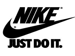
http://3dprint.com/wp-content/uploads/2014/05/nike-1.jpg
The final font I chose to discuss is of one of the most popular brands int he world, Nike. The font of Nike is used to portray the company and athletes that are sponsored by Nike. The font is very big and bold just like the athletes who wear the brand. The font also has a very strong and tough look. This exemplifies the qualities of all the athletes that Nike endorses. Nike is an athletic performance brand and just like the font, it wants its athletes to be big and tough. The font for the "Just Do It" phrase is very basic but also very meaningful. The simplistic design is used to motivate someone by saying it is not a big deal, just go out and work hard and become successful. Also the period makes this popular phrase int a motivational demand because it is telling consumers to go out there and do whatever it is you need to do in order to become a better person.
Analysis 9 & 10

http://www.showmeitaly.com/wp-content/uploads/2014/05/Show-Me-Italy-Vatican-City-Tours.jpg
The photo above is related to to Holly Donohoe's artifact, the Vatican City. The Vatican City is found in Italy. The movie was mainly based off of one place in the Vatican City, the Sistine Chapel. The chapel is home to the pope. It cost about $17 US dollars to visit inside. This relates to the business aspect of the chapel. The artistic design in the chapel has to do with the inside of the chapel. On the inside is the painting of Michelangelo. This painting alone attracts roughly 5 million visitors each year. This painting is relating with consumerism through the belief of religion. God is depicted in the painting more than 6 times and even the famous biblical story of Adam and Eve is portrayed in the painting. The movie was informative but I thought there could have been even more analysis about the design of the chapel.
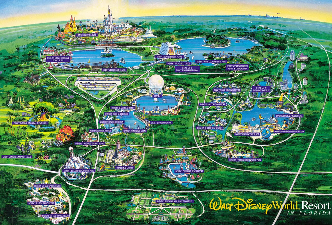
http://www.disneyworldlive.com/DisneyMap.jpg
The photo above is a map of Barry Ordu's artifact, Disney World. Disney world is located in Florida and is home to many different resorts and theme parks. It is known as "worlds within the world" because every place is different and it is like its own world. A lot of these worlds are based off of disney movies. This allows families, especially kids, feel like they are in the same world as their favorite movie characters. Disney World is home to 4 amusement parks and 2 water parks. There are also many golf courses throughout the resorts. There is something for people of all ages to do. Disney World gets most of its publicity in the media through their constant advertisements like in the Super Bowl and through the Disney Channel network. I thought this movie was very informative and dod a great job of discussing all of the different aspects of design that were covered in class.
Tuesday, March 29, 2016
Movie Discussion Summary
In our movie discussion in class I learned about how design is prevalent in movies. Design is used to help tell the story/plot of the movie without saying anything. The scenery and color of the set help portray the mood of the movie. Also the style of clothing the characters wear can reveal a lot about their personality. A lot of thought is gone into producing a movie. A director must use design to portray their message in another way other than the script. Sometimes the design in a movie is actually better at setting the mood to a scene then the script does. There is also a common theme amongst the movies. All of the movies discuss the process and evolution of the world. One movie is about the past, one is more present day, and the last one is futuristic. These movies show the process and evolution of design in movies.
Analysis 7 & 8

http://cdn.slashgear.com/wp-content/uploads/2009/09/monster_beats_solo_2-318x500.jpg
The image above is of Samantha Seger's artifact. The artifact is Beats Solo headphones. The headphones are part of a brand created by rapper and producer Dr. Dre. The brand was created in 2006. The headphones are made to produce studio quality sound. The sound projected is very similar to the sound heard in a recording booth. The headphones and brand in general get a lot of publicity. They do not have a ton of marketing but they have a lot of endorsements with athletes and musicians. They use commercials with these famous people to advertise their product. When people see their favorite celebrities and athletes, it makes them want to go out and buy a pair of their own. These headphones can be seen as a high quality product that produce incredible sound. The movie did not address all of the aspects that were discussed in class and the movie itself lacked creativity.

https://upload.wikimedia.org/wikipedia/commons/5/54/2006-2007_Volkswagen_New_Beetle.jpg
The picture above is of Carrie Burkett's artifact, the Volkswagen Beetle. The Volkswagen Beetle is a small german car. They are very popular, however, there are also many negative stereotypes with this car. I liked how Carrie showed these stereotypes, but then also then squashed the stereotypes and say that they do not matter. She then showed a video of the process of a Volkswagen Beetle being made. It was cool to see how everything was made individually, but when they all come together they produce a nice car. I also liked how Carrie brought in the popular game "slug bug" in her movie. She used a television advertisement to portray this. It was cool to see the advertisement because I knew the exact game they were playing and how it directly correlates with the car. The only thing is that not every aspect that was discussed in class was present in the video. The process and product was prevalent along with media, however, those were the only ones discussed in the video.
Subscribe to:
Posts (Atom)